
The DAG behind the data
Every summer ice cream sales spike. People also tend to drown more. Does this mean that eating ice cream causes drowning? Probably not. Most likely (and hopefully) both are a consequence of the warm weather.
The example illustrates that correlation doesn't necessarily imply causation. The pitfall — to assume that it does — shows that data can not only give us incredibly interesting insights, but can also mislead. When analysing statistical information to discern cause and effect, for example to assess the effect of a medical drug, it's important to avoid being led up the garden path.
One way of doing this is to perform experiments in as controlled a manner as possible. Randomised controlled trials are the gold standard here. But this isn't always possible. Sometimes all you can do is observe people, and processes, in the wild. How can you avoid statistical pitfalls in those situations?
Drawing a DAG
One helpful tool here is to draw a DAG. A DAG is akin to a cause-and-effect mind map. DAGs are popular with statisticians and scientists when it comes to the art of causal inference — figuring out cause and effect from data. A DAG not only helps you think through potential relationships in a systematic way, it also shows patterns that indicate where you need to be careful.
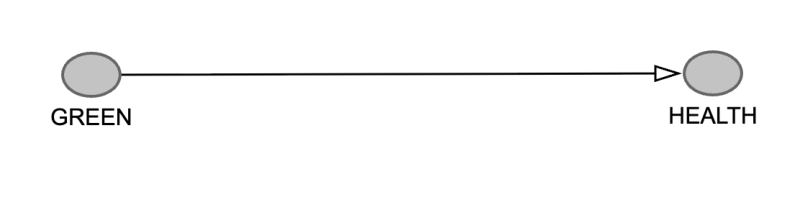
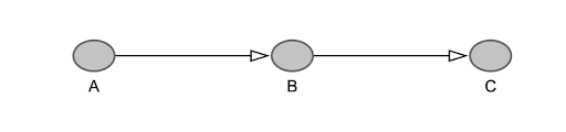
As an example, imagine you want to find out whether access to green spaces has a positive impact on people's health. Since any effects are probably long term, and you can't dictate town planning, a controlled experiment is impossible. All you can do is compare health outcomes for people in areas with lots of access to green spaces with those for people in areas with little access to green spaces.

Let's start by drawing a simple picture illustrating the presumed cause and effect relationship:
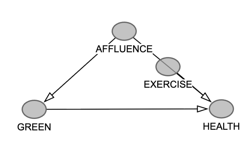
The next step is to put down other factors you can think of that might be relevant in this context. One is the affluence of an area: richer people, for a variety of reasons, tend to be healthier.
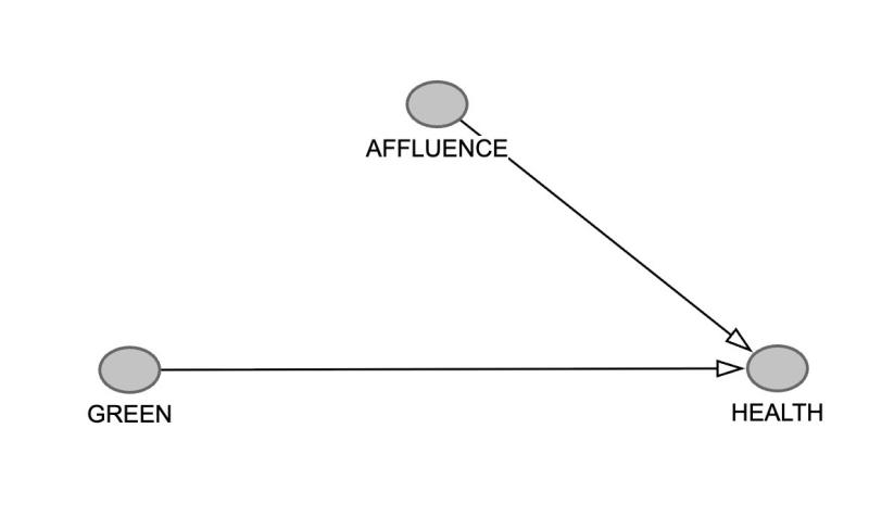
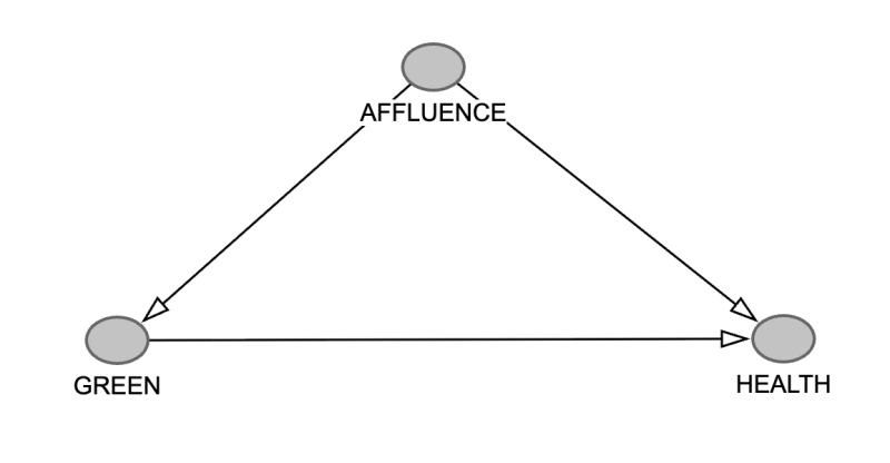
The affluence of an area also impacts the access to green spaces (e.g. rich councils have nice parks) so let's draw that arrow in too:
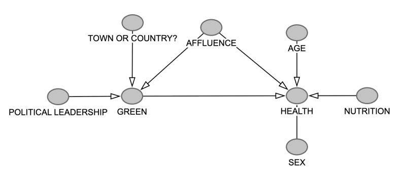
There are probably lots of other factors you can think of that are important here, so your DAG could be quite complicated:
A diagram like this is an example of directed acyclic graph, hence the acronym DAG. In maths, a graph is a collection of nodes connected by lines. A directed graph is one where the lines all have a direction, given by the arrows. Acyclic means that as you move around the graph, only ever following the direction of the arrows, you never end up where you started. This means that in a DAG a cause can't ultimately be its own effect. As a result, a DAG can't capture vicious circles and other kinds of feedback loop and it's good to be aware of that. But the power that a DAG can bring to analysis often makes up for this limitation.
To see how (and if) the various variables represented by the nodes in our DAG are interrelated you'd look at lots of different geographical areas and collect data that gives information on each of the variables. For example, for AFFLUENCE you could use average or median income and for GREEN the total area covered in green spaces. For HEALTH you could look at the prevalence of chronic disease as recorded by hospitals and GPs. You then analyse this data to see what relationships emerge.
Here is how the DAG can help.
Control the confounders
Our DAG above includes the triangle of AFFLUENCE, GREEN, and HEALTH, with two arrows coming out of AFFLUENCE. Such a triangle is called a fork and it signals the existence of a potential confounding factor: affluence. If your data suggests that people who live in areas with a lot of green spaces are healthier, then this might not be down to the green spaces at all, but to the fact that they have a lot of money. That's the analogue of our ice cream and drowning example above. The distortion that can appear due to a third, hidden factor is known as confounder bias.
Luckily there are ways of dealing with this problem. For example, you can divide the regions into bands according to their affluence: a band for average income under £10,000, a band for average income between £10,000 and £20,000 and so on, all the way to a top band for super rich regions.
You now look whether there's a correlation between green spaces and health within the individual bands. If there is — if access to green spaces correlates with better health – then this is evidence that green spaces really do have a positive impact. Since regions in a band have similar average incomes, it's probably not wealth that's causing the difference. If the correlation disappears, then any correlation seen previously was probably down to confounder bias.
The technique of constraining for fixing the value of a variable (such as average income) is called conditioning on the variable.
Don't meddle with mediators
Another type of node that calls for caution is one that provides a link between two others, like this:
The middle node is called a mediator. We haven't got one in our DAG, so let's put one in. One reason why richer people are healthier is presumably because they have more time and money to spend on exercise. So let's put a node called EXERCISE on the path from AFFLUENCE to HEALTH.
Post-treatment bias
Suppose you want to find out whether the number of years someone spent in education has an impact on their earnings later in life. A mediator that is relevant here is the level of literacy in late adolescence: the time spent in education will presumably influence literacy, which in turn is likely to influence income later on in life.
Suppose you only look at data from people with a very high level of literacy (you condition on the mediator). People in this group are probably likely to end up with high-earning jobs regardless of the time they spent in education. If this is reflected in the data, then the statistical link between time spent in education and income disappears when you condition on the mediator.
Mediators should not be conditioned on. Imagine, for example, you restrict the data set you are looking at for the mediator variable, much like we only looked at specific income bands above. Imagine that, for some reason or other, you only look at regions where people do very little exercise. Then the health of these regions is probably not going to be great, regardless of whether they are rich or poor.
Only looking at a restricted data set can mean you miss the causal relationship between affluence and health which you'd see if you hadn't conditioned on the mediator. This distortion is known as post-treatment bias. (See the box for another example).
Free the colliders
There's a third kind of configuration we should look at. It'll stretch our hypothetical set-up slightly beyond credulity, but bear with us as we illustrate the point. Suppose you also have data on the number of dogs per capita that live in a region. That number is presumably influenced by the access to green spaces - the more lovely green space there is, the more likely people are to get a dog. The number of dogs might also be influenced by the health of the region. People who are unwell probably find it harder to look after a dog. (We will ignore the happy fact that dogs can have a positive impact on people's health.)
We now get the following triangle sitting within our DAG:
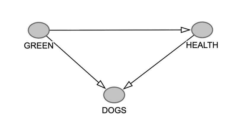
The node DOGS has two arrows pointing into it. The three nodes GREEN, DOGS and HEALTH are an example of a collider: more than one arrow "collide" at the node DOGS.
Just like a mediator, a colliding variable should not be conditioned on.
To see why, imagine that, for some reason or another, you only look at a set of regions where people own very few dogs. If there's a very healthy region within this group, it's likely (in our hypothetical example) that it has very poor access to green spaces: something must be keeping all those healthy people from owning dogs. Your statistical data might reflect this, suggesting that healthy regions are more likely to have poor access to green spaces.
If you're not aware that you're conditioning on the collider variable (the number of dogs) then you might draw the conclusion that this relationship holds generally. Good health means poor access to green spaces. This is probably nonsense.
The fact that a colliding node is associated with two (or even more) potential causes can lead to spurious relationships between the causes if you condition on the collider. It's an example of collider bias. A more realistic example is in the box.
The obesity paradox
Imagine you want to find out whether obesity leads to bad health. You look at data from hospital patients to compare health outcomes for people who are obese to health outcomes for people who are not.
The problem here is that being sick enough to be in hospital acts as a collider: it is influenced both by obesity and by other risk factors such as age, genetics, and smoking status. Among hospital patients, obese individuals tend to have fewer other risk factors on average, while non-obese individuals tend to have more. This might lead you to conclude that in general obese people are likely to have fewer other risk factors, which is not true. By restricting attention to hospital patients (conditioning on the collider), you may induce a spurious negative association between obesity and other health risks.
Backdoor paths
These examples lead us to a general set of rules for optimally using DAGs.
Suppose you want to test whether some variable X has a causal effect on another variable Y. You draw a DAG including all the factors and influences you're aware of. To do this well, you obviously need to know a lot about the topic in question (e.g. green spaces, public health, dogs). The idea is that the DAG will help you design a statistical analysis of the relevant data.
As we saw above, a fork (a node with an arrow to both X and Y) is something to be wary about as it's a way for confounder bias to creep in.
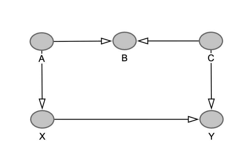
Now imagine a longer path between X and Y that starts with an arrow pointing into X. The direction of all the other arrows doesn't matter. Such a connection between X and Y is called a backdoor path. Here's an example:
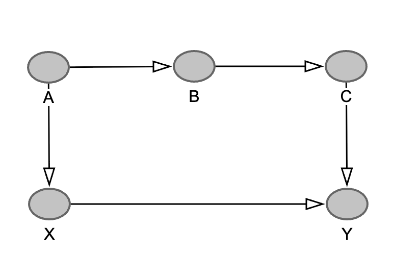
This path also opens the door for confounder bias, as any observed relationship between X and Y might be down to the fact that they could both be influenced by A. Hence the term backdoor path: the connection provides an opportunity for bias to creep in through the back door.
But now let's reverse the direction of one of the arrows so that B becomes a colliding node. The two arrows colliding at B means that (as far as we know) no node in the path can influence both X and Y, so the danger of confounding has gone away. Therefore, backdoor paths are only dangerous if they don't contain a collider.
If you want to investigate a potential causal relationship between X and Y, do the following:
- Find all the backdoor paths in the DAG that go from X to Y.
- If there isn't a collider on a backdoor path, make sure that when you analyse your data you condition on one of its nodes that is not X, Y, or a descendant of X. A variable is a descendant of X if in the DAG there's a causal path (a path which only follows the direction of the arrows) from X to that variable. A descendant in such a backdoor path is necessarily a mediator on a path from X to Y. And as we have seen above, conditioning on mediators can hide a causal link.
- If there's a collider on a backdoor path, then all is well. There's no danger of confounder bias so no need for conditioning. Indeed, as we saw above, conditioning on a collider can lead to bias.
If you now perform your analysis conditioning on the relevant nodes, there's a good chance that you identify a causal relationship between X and Y (if it exists) and that this relationship is real and not down to bias. There still is uncertainty because your DAG may not accurately reflect reality, because you may be dealing with imperfect data, or because you are using inappropriate statistical techniques for analysing your data. But at least you now have a better chance of drawing correct conclusions.
About this article
We found out about DAGs through a research programme at the Isaac Newton Institute for Mathematical Sciences called Causal inference: From theory to practice and back again. See this article to find out a little more about causal inference.
Marianne Freiberger is Editor of Plus.
This content was produced as part of our collaboration with the Isaac Newton Institute for Mathematical Sciences (INI) and the Newton Gateway to Mathematics.
The INI is an international research centre and our neighbour here on the University of Cambridge's maths campus. The Newton Gateway is the impact initiative of the INI, which engages with users of mathematics. You can find all the content from the collaboration here.